Design quality
How to Avoid Generic AI Website Design
Replace predictable AI sections with an industry-specific visual system, real content, and purposeful composition.
7 minute read
Last reviewed August 14, 2026
By Ciptaly Editorial
01 · Foundation
What is it?
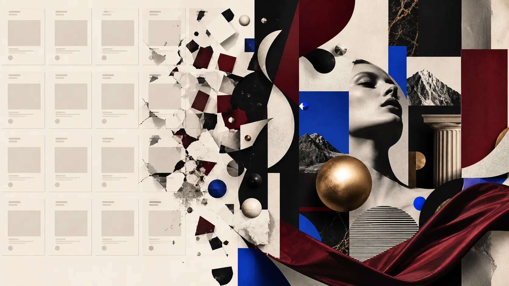
Avoid generic AI design by deriving the visual direction from the industry, audience, offer, and desired feeling before choosing sections. Use a coherent typography, colour, spacing, imagery, and interaction system, then render only content that supports a real customer decision.
Generic output often comes from treating every brief as hero, three cards, testimonials, pricing, and footer. Structure should follow the business rather than a universal SaaS template.
Distinctive design does not justify invented facts. Original composition, honest empty states, supplied media, and strong type can feel premium without fake customers or metrics.
02 · Case study
Worked scenario
A luxury pen retailer replaces generic cards with an editorial product world
A brief such as “website jual pen mewah” should not become a generic service-business page with timed packages. The industry implies objects, collections, materials, comparison, product detail, and an order or enquiry path. The visual direction should support desire and craft.
A stronger first draft might use an editorial serif, lacquer black, parchment, oxblood, brass details, close product crops, and asymmetric catalogue rhythm. Empty products remain clearly marked until the owner supplies real names, prices, images, and stock. No luxury claim is fabricated as proof.
The same quality standard continues on mobile: the product remains the visual anchor, the hierarchy is intentional, and the primary action stays clear. Distinction comes from composition and material language, not decorative gradients added to repeated cards.
Takeaway
Industry-specific art direction and composition create identity; fabricated facts and template decoration do not.
Illustrative worked example. It shows the decision process, not a claimed Ciptaly customer result.
03 · Practical process
How to approach it
- 01
Choose an art direction
Define a specific visual idea such as editorial luxury, technical precision, warm craft, or energetic sport.
- 02
Build a small design system
Set type scale, palette, spacing, borders, imagery, and motion rules before composing sections.
- 03
Vary composition
Use hierarchy, rhythm, asymmetry, and media intentionally instead of repeating equal cards.
- 04
Run a visual QA pass
Inspect desktop and mobile first impressions, readability, overflow, focus, and interaction states.
04 · Keep this honest
Quick checklist
- Specific art direction
- Coherent tokens
- No invented proof
- Desktop and mobile QA
05 · Conclusion
The practical conclusion
Demand a visual idea before demanding more sections. A coherent type, colour, image, and layout system can make a truthful first draft feel bespoke.
Use the checklist above to test the first version against one real job. Keep the facts truthful, improve one outcome at a time, and let the product grow from evidence rather than assumptions.
06 · Common questions
What beginners usually ask
Does premium design require many animations?
No. Strong typography, imagery, spacing, and interaction feedback matter more than decorative motion.
Can one template fit every industry?
A shared foundation can, but the content hierarchy, visual language, and conversion flow should adapt to the brief.