Design quality
How to Use Images in an AI-Generated Website
Choose useful, truthful visuals that strengthen identity, understanding, and trust.
6 minute read
Last reviewed August 14, 2026
By Ciptaly Editorial
01 · Foundation
What is it?
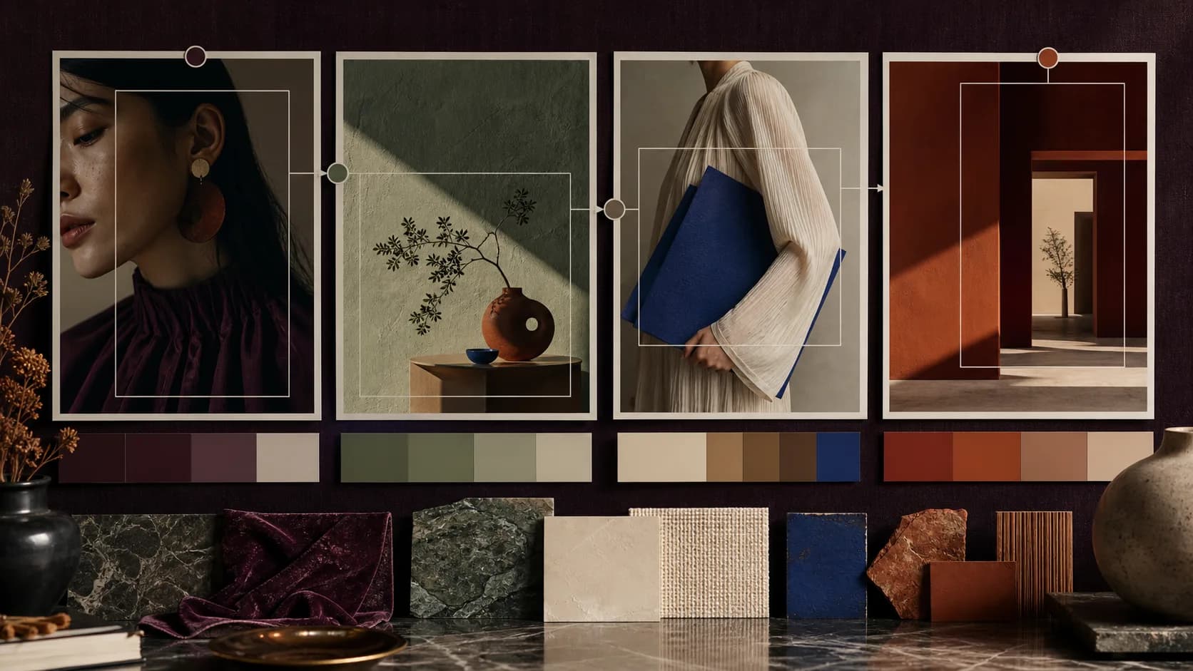
Use images that explain the offer, show real work, or create a relevant visual identity. Supply owned photography when evidence matters, generate abstract or illustrative art when appropriate, and always define dimensions, accurate alt text, responsive sizing, and loading behaviour.
A random stock portrait can damage trust more than an image-free composition. Match every visual to a specific communication job.
Generated images must not imply fake customers, locations, products, awards, or results. Abstract editorial visuals are safer when facts or assets are missing.
02 · Case study
Worked scenario
An architect’s portfolio gives every image a specific job
An architecture portfolio has access to plans, site photography, finished spaces, material details, and process sketches. Placing all of them in equal cards weakens the story because visitors cannot tell which images prove scale, craft, context, or outcome.
The art direction assigns roles: one wide project image establishes place, details reveal material quality, diagrams explain decisions, and process images support credibility. Crops, colour treatment, and spacing follow a consistent visual language while alt text describes useful content honestly.
If project imagery is missing, the site uses a deliberate content-ready state instead of unrelated stock architecture. The final experience feels curated because every visual advances understanding or trust.
Takeaway
Choose images by purpose and evidence, then direct them as one coherent visual system.
Illustrative worked example. It shows the decision process, not a claimed Ciptaly customer result.
03 · Practical process
How to approach it
- 01
Assign the image a job
Choose identity, explanation, evidence, mood, or navigation—never decoration by default.
- 02
Write an art direction
Specify subject, composition, palette, material, lighting, and placement before generating.
- 03
Prepare web formats
Use appropriate WebP or AVIF dimensions and avoid oversized source files.
- 04
Write honest alt text
Describe the useful visual content without keyword stuffing or claims the image cannot prove.
04 · Keep this honest
Quick checklist
- Communication job
- Consistent art direction
- Optimized dimensions
- Accurate alt text
05 · Conclusion
The practical conclusion
A strong image is not decoration. It should create identity, explain something, prove something, or guide a decision—and its treatment should support the surrounding page.
Use the checklist above to test the first version against one real job. Keep the facts truthful, improve one outcome at a time, and let the product grow from evidence rather than assumptions.
06 · Common questions
What beginners usually ask
Can every blog post reuse one image?
A shared cluster visual can work, but unique diagrams or examples provide stronger relevance when resources allow.
Should decorative images have alt text?
Purely decorative images should usually use empty alt text so assistive technology can skip them.